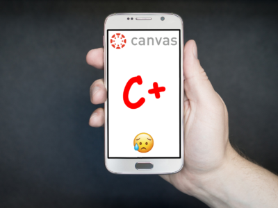
As a new student here at the University of Nebraska-Lincoln, I am getting used to the poor excuse of an online classroom called Canvas. The terribly designed website that struggles to function consistently makes my college experience more stressful every day.
However, since the Canvas app is even incredibly more unusable, the website is still my preferred way to use Canvas. The app fails to load in many cases even opening it is a nightmare as it sucks my data dry. Yet, that’s not even the worst part of the damn thing.
The Canvas mobile app’s worst quality is how it shows your grade percentages to you on the home screen. This is the single worst thing that I have ever seen in my lifelong devotion to education. And, as someone born in the computer age, it is the worst mistake in programming since myspace.
The audacity to show me how bad I’m doing in my classes is what makes it so utterly appalling. I understand that the company wants to help me keep up on my grades, but I don’t need a constant reminder that I have a 68 percent in CHEM 109.
The app is adding insurmountable amounts of stress and anxiety to my day to day student activities. I believe that this is what is causing me to fail my classes. If it’d just tuck my grades away behind like five different tabs as the website does, I believe my education would be much less stressful and much more successful. Plus I would be less sad.


