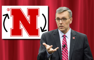
For more than 45 years, the Nebraska red “N” has been the iconic symbol of the Huskers, representing the success and excellency of this university. The logo has gone through many redesigns over the years, including its most recent one in 2015, when the sleek, bold design overtook the athletic and academic departments as the whole university’s logo.
While the new symbol has gone over favorably with students and alumni, it has also come with a small error, one that Chancellor Ronnie Green had to address in his recent press conference. Since its introduction in December 2015, the singular “N” logo has been upside down, and it will be fixed for the upcoming fall semester.
Green apologized for this blunder during the press conference, asking for a fresh start to his still young tenure.
“I’ve made a mistake as your chancellor that most should not get a second chance at,” Green said. “What I’m asking for is your forgiveness and empathy, as we can move past this “N’ mistake and grow as a campus.”
Students across the green space appreciated their chancellor’s stoic and head-on remarks, but were also confused as to why he was apologizing in the first place.
Many students could not point out the mistake even when they were told about it. Senior advertising major Jessica Warmack believes Green might be too hard on himself.
“The logo is an ambigram; it’s meant to look the same whichever way you turn it. I think that was the designer’s point,” Warmack said, who seemed to know a lot about the subject. “Unless they wanted the patent symbol on the top left side, I really see no problem.”
Nevertheless, Green is still apologetic about the whole mishap and promises to work harder in the future.
“This embarrassment will never happen again. I would resign if it weren’t for my incredibly high salary and good hours,” Green said. “I promise to look all my logos in the eye next time, making sure nothing is wrong with them.”


